Create new RichFaces Documentation Jira issue

This will launch the RichFaces Jira page - to complete your feedback please login if needed, and submit the Jira.
JBoss.orgCommunity Documentation
The <rich:toolTip> component is used for creation of event-triggered non modal popup, that contains information regarding the page element, that event was applied to.
Highly customizable look and feel
Different ways of data loading to toolTip
Disablement support
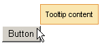
Text information, labeled on the <rich:toolTip> , is specified with "value" attribute. Text that is put between tooltip start and end tags will also be rendered as tooltip content and could be marked with HTML tags. Images, links, buttons and other RichFaces components are also may be put and composed inside the <rich:toolTip> . The <rich:toolTip> borders are stretched automatically to enclose the contents.
There are three ways to attach the <rich:toolTip> to a page element. The first and simplest one is when the <rich:toolTip> is nested into a page element the tooltip is applied to. This way is shown on example in the Creating the Component with a Page Tag section. The "attached" attribute is "true" by default in this case, which means that the tolltip will be invoked automatically when the mouse cursor is hovered above the parent component.
The second one uses <rich:toolTip> "for" attribute. In this case the <rich:toolTip> is defined separately from a component it is applied to.
Example:
<rich:panel id="panelId">

...

</rich:panel>

<rich:toolTip value="This is a tooltip." for="panelId"/>
These two ways are also applicable for HTML elements that are not presented in components tree built by facelets. Use "for" attribute to attach the <rich:toolTip> in both cases.
Example:
<!-- The <rich:toolTip> is nested into the parent HTML element -->

<div id="para1">

      <p>This paragraph and tooltip are nested into the same <div> element.</p>

      <rich:toolTip for="para1">This is a tooltip.</rich:toolTip>

</div>


<!-- The <rich:toolTip> is defined separately -->

<div id="para2">

      <p>The tooltip for this paragraph is defined separately.</p>

</div>

<rich:toolTip for="para2">This is a tooltip.</rich:toolTip>
The third way to invoke the <rich:toolTip> uses JS API function. List of JS API functions available for <rich:toolTip> is listed below. JS API functions are defined for a component the <rich:toolTip> is applied to. The <rich:toolTip> "attached" attribute should be set to "false" in this case.
Example:
<rich:panel id="panelId" onclick="#{rich:component("tooltipId")}.show(event);" />

<a4j:form>

      <rich:toolTip id="tooltipId" attached="false" value="This is a tooltip."/>

</a4j:form>
To provide <rich:toolTip> component proper work in complex cases do the following:
specify "id's" for both <rich:toolTip> and component it is applied to;
define the <rich:toolTip> as last child, when nesting it into the component the <rich:toolTip> is applied to;
put the <rich:toolTip> into <a4j:form> when invoking it with JS API function.
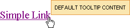
The "mode" attribute is provided you to control the way of data loading to <rich:toolTip> . The component works properly in client and Ajax modes. In client mode <rich:toolTip> content is rendered once on the server and could be rerendered only via external submit. In Ajax mode <rich:toolTip> content is requested from server for every activation. For Ajax mode there is possibility to define a facet "defaultContent" , which provides default <rich:toolTip> content to be displayed, while main content is loading into the <rich:toolTip> (see the example below).
Example:
...

<h:commandLink value="Simple Link" id="link">

    <rich:toolTip followMouse="true" direction="top-right" mode="ajax" value="#{bean.toolTipContent}" horizontalOffset="5"

        verticalOffset="5" layout="block">

        <f:facet name="defaultContent">

            <f:verbatim>DEFAULT TOOLTIP CONTENT</f:verbatim>

        </f:facet>

    </rich:toolTip>

</h:commandLink>

...
This is the result:
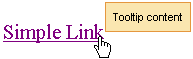
And after <rich:toolTip> loaded it is changed to next one:
<rich:toolTip>
appears attached to the corner
dependent on the
"direction"
attribute.
By default it is positioned bottom-right.
<rich:toolTip>
activation occurs after an event,
defined on the parent component, takes into consideration the "delay" attribute
or after calling JS API function show().
"hideEvent"
attribute defines the way
how
<rich:toolTip>
disappears.
It default value is "none", so the
<rich:toolTip>
does not disappears.
Deactivation may be set for example on
mouseout
event on the parent component
(excepting the situation when the mouse is hovered onto the
<rich:toolTip>
itself)
or after calling JS API function hide().
By default, <rich:toolTip> appears smart positioned. But as you can see from the previous example, you can define an appearance direction via the corresponding attribute "direction" . And also it's possible to define vertical and horizontal offsets relatively to a mouse position.
Disabled
<rich:toolTip>
is rendered to a page as usual but JS that responds for its activation is disabled until enable() is called.
Moreover, to add some JavaScript effects, client events defined on it are used:
Standart:
"onclick"
"ondblclick"
"onmouseout"
"onmousemove"
"onmouseover"
Special:
"onshow" - Called after the tooltip is called (some element hovered) but before its request
"oncomplete" - Called just after the tooltip is shown
"onhide" - Called after the tooltip is hidden
Table of <rich:toolTip> attributes.
Table 6.158. Component Identification Parameters
| Name | Value |
|---|---|
| component-type | org.richfaces.component.toolTip |
| component-class | org.richfaces.component.html.HtmlToolTip |
| component-family | org.richfaces.component.toolTip |
| renderer-type | org.richfaces.renderkit.html.toolTipRenderer |
| tag-class | org.richfaces.taglib.HtmlToolTipTag |
Table 6.159. JavaScript API
| Function | Description |
|---|---|
| show() | Shows the corresponding toolTip |
| hide() | Hides the corresponding toolTip |
| enable() | Enables the corresponding toolTip |
| disable() | Disables the corresponding toolTip |
Table 6.160. Facets
| Facet name | Description |
|---|---|
| defaultContent | Defines the default content for toolTip. It is used only if mode = "ajax" |
Table 6.161. Classes names that define a component appearance
| Class name | Description |
|---|---|
| rich-tool-tip | Defines styles for a wrapper <span> or <div> element of a toolTip |
On the component LiveDemo page you can see the example of <rich:toolTip> usage and sources for the given example.