Create new RichFaces Documentation Jira issue

This will launch the RichFaces Jira page - to complete your feedback please login if needed, and submit the Jira.
JBoss.orgCommunity Documentation
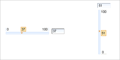
The <rich:inputNumberSlider> component is a slider component. A handler's position corresponds to a definite value on the slider track. In order to change the value you can slide a handler or set the necessary value into the input field. You can dispose it horizontally or vertically on the page.
Fully skinnable control and input elements
Optional value text field with an attribute-managed position
Optional disablement of the component on a page
Optional toolTip to display the current value while a handle is dragged
Dragged state is stable after the mouse moves
Optional manual input possible if a text input field is present
Validation of manual input
Possibility to display 2 controls that increase/decrease the value by the defined step width, when they will be clicked.
Attribute "orientation" that can have the values "vertical" and "horizontal" to define in which direction the slider should be movable.
<rich:inputNumberSlider> is used to facilitate your data input with rich UI Controls.
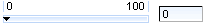
Here is the simplest variant of a slider definition with "minValue" , "maxValue" and "step" (by default is "1") attributes, which define the beginning and the end of a numerical area and a slider property step.
Example:
<rich:inputNumberSlider></rich:inputNumberSlider>
Here is a component generated on a page:
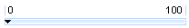
Using "showInput" (default value is "true") and "enableManualInput" (default value is "true") attributes, it's possible to output the input area near the slider, and make it read-only or editable.
To remove input area use
showInput = "false"
:
Example:
<rich:inputNumberSlider minValue="1" maxValue="100" showInput="false"/>
It's displayed on a page like this:
It's also possible to switch off displaying of "boundary values" and a toolTip showing on a handle drawing. This could be performed with the help of the component defined attributes: "showBoundaryValues" which is responsible for "boundary values" displaying (default value is "true") and "showToolTip" which is responsible for tooltTip displaying (default value is "true").
Moreover, to add e.g. some JavaScript effects, events defined on it are used.
"onchange"
"onmouseover"
"onclick"
"onfocus"
"onmouseout"
etc.
The
"label"
attribute is a generic attribute. The
"label"
attribute provides an association between the component and
the message that the component (indirectly) produced. This
attribute defines the parameters of a localized error and
informational messages that occur as a result of conversion,
validation, or other application actions during the request
processing lifecycle. With the help of this attribute you
can replace the last parameter substitution token shown in
the messages. For example, {1} for
"DoubleRangeValidator.MAXIMUM"
, {2} for
"ShortConverter.SHORT".
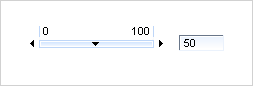
The "showArrows" boolean attribute when set to "true" enables additional controls for increasing and decreasing slider value. The controls (arrows by default) are placed in the beginning and in the end of a slider track:
Clicking an arrow changes the driven value on the amount defined with "step" attribute. Keepeng an arrow control pressed changes the value continuous. Time that value takes to change from one step to another is definded with "delay" attribute.
Table of <rich:inputNumberSlider> attributes.
Table 6.196. Component Identification Parameters
| Name | Value |
|---|---|
| component-type | org.richfaces.inputNumberSlider |
| component-class | org.richfaces.component.html.HtmlInputNumberSlider |
| component-family | org.richfaces.inputNumberSlider |
| renderer-type | org.richfaces.InputNumberSliderRenderer |
| tag-class | org.richfaces.taglib.InputNumberSliderTag |
Table 6.197. Style classes (selectors) with the corresponding skin parameters
| Class (selector) name | Description | Skin Parameters | CSS properties mapped |
|---|---|---|---|
| .rich-inslider-tip | Defines styles for a hint | tipBackgroundColor | background-color |
| tipBorderColor | border-color | ||
| generalFamilyFont | font-family | ||
| generalSizeFont | font-size | ||
| .rich-inslider-left-num | Defines styles for the left number | panelBorderColor | border-color |
| generalFamilyFont | font-family | ||
| generalSizeFont | font-size, line-height | ||
| generalTextColor | color | ||
| .rich-inslider-right-num | Defines styles for the right number | panelBorderColor | border-color |
| generalFamilyFont | font-family | ||
| generalSizeFont | font-size, line-height | ||
| generalTextColor | color | ||
| .rich-inslider-track | Defines styles for the wrapper <div> element of the slider track | controlBackgroundColor | background-color |
| .rich-inslider-track-decor-1 | Defines styles for the wrapper <table> element of the slider track | panelBorderColor | border-color |
| .rich-inslider-track-decor-2 | Defines styles for the slider track | controlBackgroundColor | border-color |
| .rich-inslider-field | Defines styles for a text field | controlBackgroundColor | background-color |
| generalFamilyFont | font-family | ||
| generalSizeFont | font-size | ||
| controlTextColor | color | ||
| panelBorderColor | border-color |
Table 6.198. Style classes (selectors) without skin parameters
| Class name | Description |
|---|---|
| .rich-slider | Defines styles for the wrapper <table> element of the component |
| .rich-inslider-handler | Defines styles for the slider handler |
| .rich-inslider-handler-vertical | Defines styles for the vertical slider handler |
| .rich-inslider-track-vertical | Defines styles for the vertical slider track |
| .rich-inslider-handler-selected | Defines styles for a selected handler |
| .rich-inslider-handler-selected-vertical | Defines styles for a selected handler on the vertical slider |
| .rich-inslider-track-border | Defines styles for track border |
| .inputNumberSlider-increase-vertical | Defines styles for the top arrow |
| .inputNumberSlider-decrease-vertical | Defines styles for the bottom arrow |
| .inputNumberSlider-increase-horizontal | Defines styles for the right arrow |
| .inputNumberSlider-decrease-horizontal | Defines styles for the left arrow |
You can find all necessary information about style classes redefinition in Definition of Custom Style Classes section.
On the component Live Demo page you can see the example of <rich:inputNumberSlider> usage and sources for the given example.