Create new RichFaces Documentation Jira issue

This will launch the RichFaces Jira page - to complete your feedback please login if needed, and submit the Jira.
JBoss.orgCommunity Documentation
The component is meant for rendering tables and differs from the standard <rich:dataTable> component in that supports some extended features.
Possibility to scroll data
Possibility to add an attribute to set the kind of selection (none, single line or multiple lines)
Possibility to change the sequence of the displayed columns by dragging the column-header to another position
Possibility to show or hide columns by selecting or deselecting them in a context menu
Possibility to save the current settings (visible columns, column width, sequence of the columns) to be reused the next time the page will be shown
Possibility to combine rows to groups
<rich:extendedDataTable> includes the following attributes not included with <rich:dataTable>:
<rich:extendedDataTable> does not include the following attributes available with <rich:dataTable>:
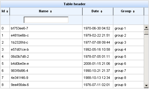
The <rich:extendedDataTable> component is similar to the <rich:dataTable> , but <rich:extendedDataTable> supports some extended features (see the "Key Features" section above). The data in the component is scrollable. You can also set the type of selection ( "none", "single" or "multi" lines). Selection of multiple lines is possible using Shift and Ctrl keys.
Here is an example:
Example:
...

<rich:extendedDataTable id="edt" value="#{extendedDT.dataModel}" var="edt" width="500px" height="500px" selectedClass="dataTableSelectedRow" sortMode="single" selectionMode="multi" selection="#{extendedDT.selection}" rowKeyVar="rkvar" tableState="#{extendedDT.tableState}">

       <rich:column id="id" headerClass="dataTableHeader" width="50" label="Id" sortable="true" sortBy="#{edt.id}" sortIconAscending="dataTableAscIcon" sortIconDescending="dataTableDescIcon">

              <f:facet name="header">

                     <h:outputText value="Id" />

              </f:facet>

              <h:outputText value="#{edt.id}" />

       </rich:column>

       <rich:column id="name" width="300" headerClass="dataTableHeader" label="Name" sortable="true" sortBy="#{edt.name}" sortIconAscending="dataTableAscIcon" sortIconDescending="dataTableDescIcon" filterBy="#{edt.name}" filterEvent="onkeyup" visible="false">

              <f:facet name="header">

                     <h:outputText value="Name" />

              </f:facet>

              <h:outputText value="#{edt.name}" />

       </rich:column>

       <rich:column id="date" width="100" headerClass="dataTableHeader" label="Date" sortable="true" comparator="#{extendedDT.dateComparator}" sortIconAscending="dataTableAscIcon" sortIconDescending="dataTableDescIcon">

              <f:facet name="header">

                     <h:outputText value="Date" />

              </f:facet>

              <h:outputText value="#{edt.date}"><f:convertDateTime pattern="yyyy-MM-dd HH:mm:ss" />

              </h:outputText>

       </rich:column>

       <rich:column id="group" width="50" headerClass="dataTableHeader" label="Group" sortable="true" sortBy="#{edt.group}" sortIconAscending="dataTableAscIcon" sortIconDescending="dataTableDescIcon">

              <f:facet name="header">

                     <h:outputText value="Group" />

              </f:facet>

              <h:outputText value="#{edt.group}" />

       </rich:column>

</rich:extendedDataTable>

...
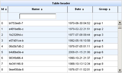
Information about sorting and filtering can be found in RichFaces Developer Guide section on sorting.
For external filtering the <rich:extendedDataTable> component supports the "filter" facet for <rich:column> . In this facet you can define your own controls for filtering which will be positioned like built-in filter controls. Rest of the filter scenario is the same as described in the RichFaces Developer Guide section on filtering.
In the example the "selection" attribute contains an object with selected rows.
The "height" attribute is mandatory. The default value is "500px" .
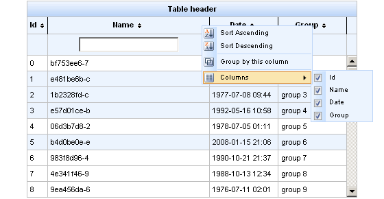
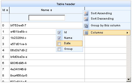
Menu on the right side of the column header is used to perform actions like sorting, grouping, hiding columns.
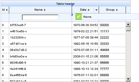
This is an example:
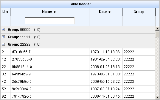
After selecting a "Group by this column" option, you can see the data grouped. You can collapse and expand groups by clicking on a group header.
This is an example:
The "label" attribute in <rich:column> sets the name of the column, which is used when dragging columns (in drag window) and in context menu, in "Columns" submenu.
Example:
...

<rich:column id="name" label="#{msg['name']}"

...
The <rich:extendedDataTable> component columns can be hidden:
The "tableState" attribute can be used to bind state of the table (column width, column position, visible, sequence, grouping...) to a backing-bean string property, for a later used. This state can be for example saved to a database, and it is different from standard JSF state saving mechanisms.
Example:
...

<rich:extendedDataTable tableState="#{extendedDT.tableState}">

...
Table of <rich:extendedDataTable> attributes.
Table 6.59. Component Identification Parameters
| Name | Value |
|---|---|
| component-type | org.richfaces.ExtendedDataTable |
| component-class | org.richfaces.component.html.HtmlExtendedDataTable |
| component-family | org.richfaces.ExtendedDataTable |
| renderer-type | org.richfaces.ExtendedDataTableRenderer |
| tag-class | org.richfaces.taglib.ExtendedDataTableTag |
Table 6.60. Facets
| Facet | Description |
|---|---|
| header | Redefines the header content |
| footer | Redefines the footer content |
| caption | Redefines the caption content |
Table 6.61. Style classes (selectors) with the corresponding skin parameters
| Class (selector) name | Description | Skin Parameters | CSS properties mapped |
|---|---|---|---|
| .extdt-empty-cell | Defines styles for empty cells of the component | tableBorderWidth, tableBorderColor | border-bottom |
| .extdt-table-layout | Defines styles for the table layout | tableBackgroundColor | background-color |
| .extdt-cell | Defines styles for the table cells | tableBorderWidth, tableBorderColor | border-right, border-bottom |
| generalSizeFont | font-size | ||
| generalTextColor | color | ||
| generalFamilyFont | font-family | ||
| .extdt-header | Defines styles for the header | headerBackgroundColor | background-color |
| .extdt-header-continue | Defines styles for all header lines after the first | headerBackgroundColor | background-color |
| .extdt-headercell | Defines styles for the header cells | tableBorderWidth, tableBorderColor | border-right, border-bottom |
| generalSizeFont | font-size | ||
| headerTextColor | color | ||
| headerWeightFont | font-weight | ||
| generalFamilyFont | font-family | ||
| .extdt-subheader | Defines styles for the subheader | additionalBackgroundColor | background-color |
| .extdt-table-filterrow | Defines styles for the filter row | additionalBackgroundColor | background-color |
| tableBorderWidth, tableBorderColor | border-top | ||
| .extdt-subheadercell | Defines styles for the subheader cells | tableBorderWidth, tableBorderColor | border-right, border-bottom |
| generalSizeFont | font-size | ||
| generalTextColor | color | ||
| generalFamilyFont | font-family | ||
| .extdt-caption | Defines styles for the table caption | tableBorderWidth, tableBorderColor | border-bottom |
| generalSizeFont | font-size | ||
| headerWeightFont | font-weight | ||
| generalTextColor | color | ||
| generalFamilyFont | font-family | ||
| additionalBackgroundColor | background-color | ||
| .extdt-footercell | Defines styles for the footer cell | tableBorderWidth, tableBorderColor | border-right, border-bottom |
| generalSizeFont | font-size | ||
| generalTextColor | color | ||
| headerWeightFont | font-weight | ||
| generalFamilyFont | font-family | ||
| .extdt-subfootercell | Defines styles for the subfooter cell | tableBorderWidth, tableBorderColor | border-right, border-bottom |
| generalSizeFont | font-size | ||
| generalTextColor | color | ||
| generalFamilyFont | font-family | ||
| .extdt-row-selected | Defines styles for the selected row | additionalBackgroundColor | background-color |
| .extdt-row-active | Defines styles for the active row | tabDisabledTextColor | color |
Table 6.62. Style classes (selectors) without skin parameters
| Class name | Description |
|---|---|
| .rich-extdt | Defines styles for all table |
| .rich-extdt-caption | Defines styles for a "caption" facet element |
| .rich-extdt-header | Defines styles for a table header row |
| .rich-extdt-header-continue | Defines styles for all header lines after the first |
| .rich-extdt-subheader | Defines styles for a column header |
| .rich-extdt-footer | Defines styles for a footer row |
| .rich-extdt-footer-continue | Defines styles for all footer lines after the first |
| .rich-extdt-subfooter | Defines styles for a column footer |
| .rich-extdt-headercell | Defines styles for a header cell |
| .rich-extdt-subheadercell | Defines styles for a column header cell |
| .rich-extdt-cell | Defines styles for a table cell |
| .rich-extdt-row | Defines styles for a table row |
| .rich-extdt-firstrow | Defines styles for a table start row |
| .rich-extdt-footercell | Defines styles for a footer cell |
| .rich-extdt-subfootercell | Defines styles for a column footer cell |
| .rich-extdt-group-cell | Defines styles for a grouping row cell |
You can find all necessary information about style classes redefinition in Definition of Custom Style Classes section.
Some additional information about the component usage can be found on its LiveDemo page.