Create new RichFaces Documentation Jira issue

This will launch the RichFaces Jira page - to complete your feedback please login if needed, and submit the Jira.
JBoss.orgCommunity Documentation
The <rich:comboBox> component allows to create a combobox element with the built-in Ajax capability.
Client-side suggestions
Browser like selection
Smart user-defined positioning
Seam entity converter support
Highly customizable look and feel
Disablement support
The <rich:comboBox> is a simplified suggestion box component, that provides input with client-side suggestions. The component could be in two states:
Default - only input and button is shown
Input, button and a popup list of suggestions attached to input is shown
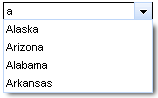
There are two ways to get values for the popup list of suggestions:
Using the "suggestionValues" attribute, that defines the suggestion collection
...

<rich:comboBox value="#{bean.state}" suggestionValues="#{bean.suggestions}" />

...
Using the <f:selectItem /> or <f:selectItems /> JSF components.
...

<rich:comboBox value="#{bean.state}" valueChangeListener="#{bean.selectionChanged}">

        <f:selectItems  value="#{bean.selectItems}"/>

        <f:selectItem itemValue="Oregon"/>

        <f:selectItem itemValue="Pennsylvania"/>

        <f:selectItem itemValue="Rhode Island"/>

        <f:selectItem itemValue="South Carolina"/>

</rich:comboBox>

...
These JSF components consider only the "value" attribute for this component.
Popup list content loads at page render time. No additional requests could be performed on the popup calling.
The "value" attribute stores value from input after submit.
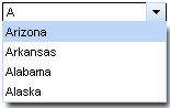
The "directInputSuggestions" attribute defines, how the first value from the suggested one appears in an input field. If it's "true" the first value appears with the suggested part highlighted.
...

<rich:comboBox value="#{bean.state}" suggestionValues="#{bean.suggestions}" directInputSuggestions="true" />

...
This is a result:
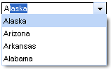
The "selectFirstOnUpdate" attribute defines if the first value from suggested is selected in a popup list. If it's "false" nothing is selected in the list before a user hovers some item with the mouse.
...

<rich:comboBox value="#{bean.state}" suggestionValues="#{bean.suggestions}" selectFirstOnUpdate="false" />

...
This is a result:
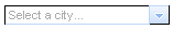
The "defaultLabel" attribute defines the default label of the input element. Simple example is placed below.
...

<rich:comboBox value="#{bean.state}" suggestionValues="#{bean.suggestions}" defaultLabel="Select a city..." />

...
This is a result:
With the help of the "disabled" attribute you can disable the whole <rich:comboBox> component. See the following example.
...

<rich:comboBox value="#{bean.state}" suggestionValues="#{bean.suggestions}" defaultLabel="Select a city..." disabled="true" />

...
This is a result:
The
"enableManualInput"
attribute enables/disables input field, so when enableManualInput = "false",
user can only pick the value manually and has no possibility to type in the value (default value is "false").
The <rich:comboBox> component provides to use specific event attributes:
"onlistcall" which is fired before the list opening and gives you a possibility to cancel list popup/update
"onselect" which gives you a possibility to send Ajax request when item is selected
The <rich:comboBox> component allows to use sizes attributes:
"listWidth" and "listHeight" attributes specify popup list sizes with values in pixels
"width" attribute customizes the size of input element with values in pixels.
Table of <rich:comboBox> attributes.
Table 6.171. Component Identification Parameters
| Name | Value |
|---|---|
| component-type | org.richfaces.ComboBox |
| component-class | org.richfaces.component.html.HtmlComboBox |
| component-family | org.richfaces.ComboBox |
| renderer-type | org.richfaces.renderkit.ComboBoxRenderer |
| tag-class | org.richfaces.taglib.ComboBoxTag |
Table 6.172. JavaScript API
| Function | Description |
|---|---|
| showList() | Shows the popup list |
| hideList() | Hides the popup list |
| enable() | Enables the control for input |
| disable() | Disables the control for input |
Table 6.173. Style classes (selectors) with the corresponding skin parameters
| Class (selector) name | Description | Skin Parameter | CSS properties mapped |
|---|---|---|---|
| input.rich-combobox-button-background, input.rich-combobox-button-background-disabled, input.rich-combobox-button-background-inactive | Define styles for a background of the combobox button, disabled button and inactive button respectively | tabBackgroundColor | background-color |
| input.rich-combobox-button-pressed-background | Define styles for a background of the pressed button | tabBackgroundColor | background-color |
| input.rich-combobox-button, input.rich-combobox-button-inactive, input.rich-combobox-button-disabled | Define styles for the combobox button, disabled button and inactive button respectively | panelBorderColor | border-top-color |
| panelBorderColor | border-left-color | ||
| .rich-combobox-font, input.rich-combobox-font | Define styles for a font | generalSizeFont | font-size |
| generalFamilyFont | font-family | ||
| generalTextColor | color | ||
| input.rich-combobox-font-disabled, .rich-combobox-font-disabled | Defines styles for a disabled font | headerFamilyFont | font-family |
| headerSizeFont | font-size | ||
| input.rich-combobox-font-inactive, .rich-combobox-font-inactive | Defines styles for an inactive font | generalSizeFont | font-size |
| generalFamilyFont | font-family | ||
| generalTextColor | color | ||
| .rich-combobox-item | Defines styles for an item | generalSizeFont | font-size |
| generalFamilyFont | font-family | ||
| generalTextColor | color | ||
| .rich-combobox-input, .rich-combobox-input-disabled, .rich-combobox-input-inactive | Define styles for an input field, a disabled input field, an inactive input field respectively | controlBackgroundColor | background-color |
| panelBorderColor | border-bottom-color | ||
| panelBorderColor | border-right-color | ||
| .rich-combobox-item-selected | Defines styles for a selected item | headerBackgroundColor | background-color, border-color |
| headerTextColor | color | ||
| .rich-combobox-list-decoration | Defines styles for a list decoration | panelBorderColor | border-color |
| tableBackgroundColor | background | ||
| input.rich-combobox-button-hovered | Defines styles for a hovered button | selectControlColor | border-color |
Table 6.174. Style classes (selectors) without skin parameters
| Class name | Description |
|---|---|
| .rich-combobox-shell | Defines styles for a wrapper <div> element of a list |
| .rich-combobox-list-position | Defines position of a list |
| .rich-combobox-list-scroll | Defines styles for a list scrolling |
| input.rich-combobox-button-icon | Defines styles for a button icon |
| input.rich-combobox-button-icon-inactive | Defines styles for an inactive button icon |
| input.rich-combobox-button-icon-disabled | Defines styles for a disabled button icon |
| .rich-combobox-shadow | Defines styles for a wrapper <div> element of a shadow |
| .rich-combobox-shadow-tl | Defines styles for a top-left element of a shadow |
| .rich-combobox-shadow-tr | Defines styles for a top-right element of a shadow |
| .rich-combobox-shadow-bl | Defines styles for a bottom-left element of a shadow |
| .rich-combobox-shadow-br | Defines styles for a bottom-right element of a shadow |
You can find all necessary information about style classes redefinition in Definition of Custom Style Classes section.
Visit the ComboBox page at RichFaces LiveDemo for examples of component usage and their sources.